Colour psychology: how colour meanings affect your brand
When you’re in business – whether you’re starting out in the world of eCommerce, or you’re doing something completely different – then you’ll already be aware of the importance of your logo, and your branding materials. We’re all aware of major brands and how they become instantly recognisable – from the Coca Cola logo to the Nike swoosh. Branding has such power that even children come to recognise brands instantly – think of the pester power that McDonald’s, Lego and My Little Pony (amongst many, many others!) that parents come to dread. Research has shown that youngsters are able to recognise brands from as young as age 3, and in many cases, much earlier.
Colour is equally as powerful as logo design too. We all know the colours of brands like Coca Cola, Barbie and Cadbury – those shades of red, pink and purple are utterly synonymous with the businesses and what they do, aren’t they? For many of us, a glimpse of Cadbury purple is likely to set our saliva glands to work – a powerful conditioning effect from years of delicious treats.
With that in mind, when you’re building your business, it is crucial to carefully consider the colours you are going to use for your business. You might already have an idea of the colours you intend to use, or you might be more concerned with other aspects of getting your business up and running. But if you haven’t thought too much about it yet, or you’re unsure of which colours are most appropriate for your business, then it is definitely worth considering the insights that colour psychology offers.
What is colour psychology?
The idea of colour psychology first emerged in the 1940’s, when Kurt Goldstein suggested that colours can provoke certain physiological reactions. With that idea, Goldstein claimed that colours could help to direct attention and focus. With that in mind, and as TV and print media started to become more readily available through the 20th century, companies who realised the power that colour psychology could offer them started funding research. However, humans have been aware of the power of colour for much, much longer than that – it is thought that ancient Egyptians studied the effect of colours on mood!
Today, colour psychology is a widely discussed topic, and can be immensely valuable for anyone who wants to market a product, or their business. Research suggests that consumers
“make a subconscious judgment about a person, environment, or product within 90 seconds of initial viewing and that between 62% and 90% of that assessment is based on colour alone.”
That statement alone tells us just how important colour can be to your business!
As we’ve already mentioned, some brands today can be recognised by colour alone – even without their logo. Think Cadbury purple, Barbie pink and Tiffany and Co blue. We bet you can bring those exact colours to mind without even turning to Google! Unsurprisingly, to deter copycats and fakes, some of these brands have trademarked their particular shades. Your business may never get to that point, but your use of colour is still incredibly important to your brand – so make sure you think carefully about what you want your branding to convey.
General model of colour psychology
There are six principles of the general model of colour psychology:
- Colour can carry a specific meaning.
- Colour meaning is either based in learned meaning or biologically innate meaning.
- The perception of a colour causes evaluation automatically by the person perceiving.
- The evaluation process forces colour-motivated behaviour.
- Colour usually exerts its influence automatically.
- Colour meaning and effect is heavily influenced by the context.
When we consider these six principles, it is clear why colour is so important to the world around us – we’re constantly impacted by colour, and the meanings behind those colours. Some are natural to us, such as being wary about eating an unknown red berry due to the colour, or it is learned – like knowing that a purple wrapper on a product at a supermarket checkout is likely to contain chocolate.
Why is colour psychology important for marketing your brand?
When you’re developing your business, and your branding materials, you want the effect to be memorable for all the right reasons. Choosing the right colours means your logo, and your marketing materials will have the right first impression on your customers.
If you’re an international brand (or plan to be!) you may need to be even more careful when it comes to your use of colour. Although in the west, black is typically worn to signify mourning and loss, worldwide different colours are used – from white in Eastern Asia, purple is worn in Brazil and Thailand, and grey in Papua New Guinea. Your use of colour can impact significantly on the success of your business in those markets, so you might decide to use a black and white version of your logo where this is appropriate. You might even use different branding altogether – but it is up to you to ensure you’ve done your research before making those decisions.
Colour meanings and connotations
If you’re just starting out in business, and you’re thinking about designing your company logo, website design and so on, colour will already be something you’re thinking about. We’re going to take a look at different colours and what they imply throughout this post. Some of these will be obvious to you – and you might think hardly worth mentioning, since some of them are so intuitive – but these connotations can have powerful implications for how customers, and business associates see your company.
Red colour psychology
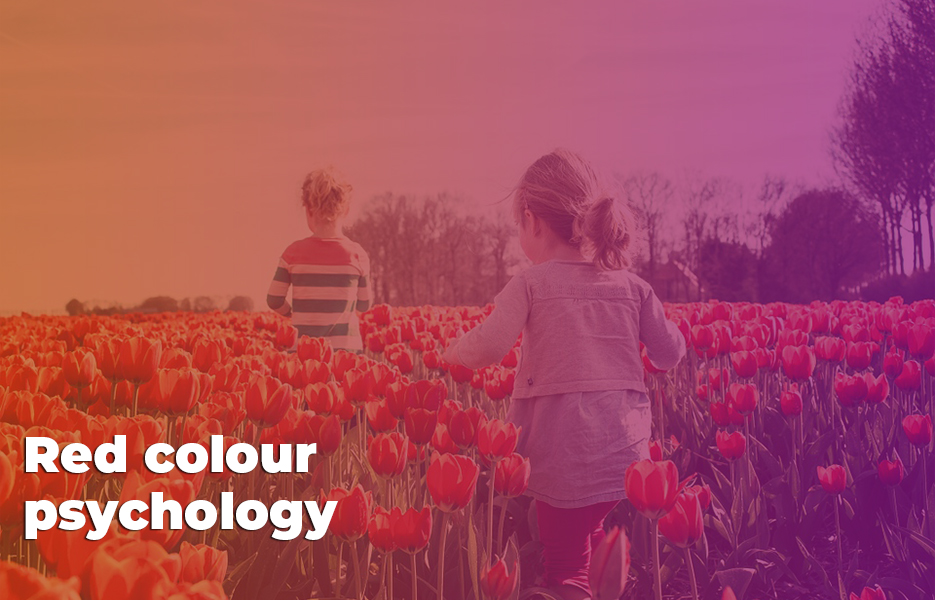
Bright, vibrant and dynamic, red has traditionally been used to represent energy and action. It has been found to boost our physical energy levels, and can prompt the release of adrenaline. It can also be seen as relating to physical desires – both sexual and hunger. Unsurprisingly, red has been used to represent passion – either love or hate – as well as by businesses hoping to feed you!
Red is a great example of how colour has different meanings in different countries. In China, red is considered to be lucky – with some students even wearing red underwear for exams. (although some avoid wearing red, since fail scores are written in red on score sheets…!) In other countries such as South Africa, red is seen as a colour of mourning, representing bloodshed through the Apartheid era.
Effects of red
Red is incredibly stimulating to the physical senses. It can evoke lust, hunger and courage. That’s undoubtedly one of the reasons that Coca-Cola and fast food restaurants like McDonald’s, Pizza Hut, KFC and Burger King use red extensively on their logos.
That stimulation is important if to note you’re a driver of a red car. Guéguen’s study that found that drivers of red cars are significantly more aggressive, beeping their horns sooner, and more often than any other colour car. While it is claimed that many insurance companies don’t even ask the colour of your car and that colour doesn’t matter to them, you might find you have more road rage than in a car of another colour. And those of us that don’t drive red cars – well, we might just try to stay out of the way of them!
“Put on your red shoes, and dance the blues.” – David Bowie
Positive connotations associated with red
- Action
- Energy and speed
- Attention-getting
- Assertive, confident and driven
- Energizing, stimulating and exciting
- Powerful, strong and courageous
- Passion
- Spontaneous and determined
Negative connotations associated with red
- Aggressive,ruthless,domineering and over-bearing
- Angry, quick-tempered,violent and brutal
- Fearful, intolerant and resentful
- Rebellious and obstinate
Common uses of red
Since the colour red is also linked with danger – such as in the case of poisonous berries in the wild – red definitely attracts attention. That’s why it is used for traffic lights, and is used so often for calls to action, or sale banners in retail or on eCommerce websites.
Red is also widely used to signify heat, as well as passion, and have long been associated with both cupid and the devil.
Red has also become associated with AIDS awareness worldwide, but particularly in Africa, due to the wide promotion of the (RED) campaign. If you’re operating in Africa, or thinking about doing so, this may be something you need to be aware of – not to shy away from it necessarily, but to be aware of the implications it may have for your business in some African countries.
The colour red is also widely associated with communism –which may be a consideration for companies that are doing business in countries that were, or still are, communist states.,
Brands that use red
- Kellogg’s
- Texaco
- Heinz
- Coca Cola
- KFC
- Virgin
- Netflix
- Lego
- Santander
Shades of red
Maroon, burgundy, crimson, scarlet, ruby
Orange colour psychology

Thought to be warm and cheery – combining the energy and stimulation of red with the brightness of yellow. Orange has typically come to represent social communication, interaction and friendship. Little wonder that Amazon chose orange as a major colour in their branding – it implies so much of what they stand for!
Effects of orange
Orange has been found to have stimulating effects on the body – encouraging enthusiasm, vitality and rejuvenation. There’s also thoughts that orange can be help us to be courageous – and is thought to help people move on from and negative life events like divorce.
“Orange is the happiest color.” – Frank Sinatra
Positive connotations associated with orange
- Sociable and cheerful
- Extroverted and uninhibited
- Optimistic, enthusiastic
- Self-confident, independent and adventurous
- Risk-taking
- Flamboyant with creative flair
- Warm-hearted, agreeable and informal
Negative connotations associated with orange
- Superficial and insincere
- Over-bearing and self-indulgent
- Dependent
- Exhibitionist
- Pessimistic
- Inexpensive
- Overly proud
Common uses of orange
Since orange has a lot of red in it, orange can be used in place of red where businesses want to capitalise on the effects of red, without being so obvious. It’s one of the reasons that many restaurants use orange on their walls – although usually using softer shades of orange such as apricot, peach or terracotta – to help customers feel hungry and to increase contentment. Since it is also linked with social communication, shades of orange on the walls in restaurants can help increase the time customers linger over their meals. And since extra time chatting means extra courses and drinks purchased, use of orange in décor can add to the possible profit for each table.
Orange has also traditionally been associated with the autumn season due to the colour of pumpkins and falling leaves. Since autumn is a transitional season, orange has also become associated with transitional situations and change.
Brands that use orange
- Amazon
- Mozilla Firefox
- Nickelodeon
- Harley Davidson
- Fanta
- Blogger
Shades of orange
Peach, golden orange, amber, burnt orange, terracotta, dark orange, salmon, tangerine, apricot
Yellow colour psychology
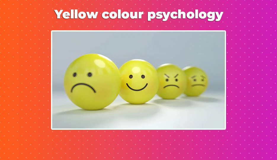
Traditionally thought of as cheerful, yellow is strongly associated with summer and the colour of sunshine. It’s the lightest colour of the spectrum, but is still attention grabbing. When over-used – such as in a room that is painted completely yellow – it can cause people to feel frustration and anger. It has been found that people are much more likely to lose their tempers in rooms that are painted yellow, and it has been found that babies cry more in yellow rooms – which we’re sure you’ll agree is definitely worth knowing when decorating a nursery ready for a new-born!
Effects of yellow
Yellow has been found to be a very creative colour – it stimulates our brains and activates the left, analytical brain, which can also help us make decisions more quickly. It’s seen as a happy colour, helping create a sense of fun; although in contrast, it can be found to produce anxiety and nervousness, as well as making people more critical. Findings about the colour yellow are then, a bit of a mixed bag – so use yellow carefully and intentionally in your marketing materials.
“How wonderful yellow is. It stands for the sun.” – Vincent van Gogh
Positive connotations associated with yellow
- Optimism, cheerfulness and enthusiasm
- Fun and good-humour
- Energy
- Confidence
- Originality and creativity
- Challenge
- Academic and analytical
- Wisdom and logic
Negative connotations associated with yellow
- Critical and judgmental
- Analytical (although this can be a good thing, this can be negative too!)
- Being impatient and impulsive
- Being egotistical
- Pessimism
- Inferiority complexes
- Spiteful, cowardly and deceitful
- Non-emotional and lacking compassion
Common uses of yellow
In addition to being used to imply sunshine and summer days, yellow is also the most easily spotted colour from a distance. That’s why it is often used for objects that need to be seen, or for warnings – school buses, road signs, taxis and rescue vehicles, as well as in traffic lights and railway signals to indicate drivers should be cautious.
Yellow is a colour that is widely used throughout world religions, in terms of both yellow and gold – so be sure to understand the meanings of certain shades of yellow, particularly in countries where Buddhism is practiced widely.
Brands that use yellow
- McDonald’s
- Ikea
- DHL
- Cat
- Ferrari
- National Geographic
- Schweppes
- Nikon
Shades of yellow
Lemon, citrine, golden yellow, cream, dark yellow, gold, saffron
Pink colour psychology
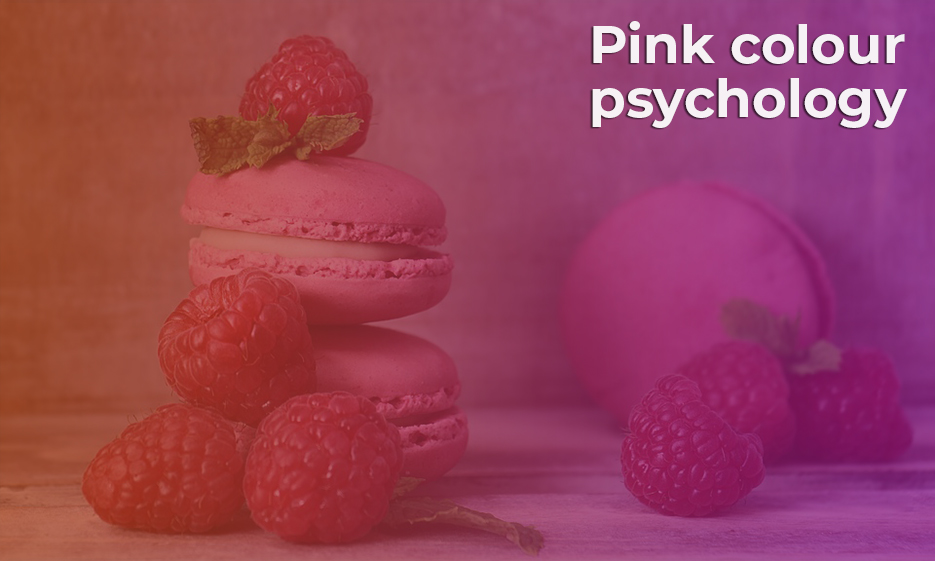
Generally pink has been associated with love and care, tenderness and immaturity. Since the base colour of pink is red, it is also associated with passion, with deeper pinks conveying more passion and energy. The physical passion of the red is seen to be toned down with white – traditionally seen as a colour of purity – to create a gentler, more loving energy.
As a colour, it has been associated with young children – first with boys, then, thanks to extensive marketing through the latter half of the 20th century, with girls.
Effects of pink
Pink is generally a non-threatening colour, and is calming to the emotions, even in the deeper pinks that can be seen as more aggressive and confident. In some prisons, a shade known as ‘drunk tank pink’ is used on walls to calm inmates, and some sports teams paint the away team dressing room pink to help keep their opposition calmer, more passive and less energetic.
“Whoever said orange was the new pink was seriously disturbed.” – Elle Woods
[Reese Witherspoon, Legally Blonde, 2001]
Positive connotations associated with pink
- Unconditional and romantic love, romance
- Compassion and understanding nurturing
- Sweetness
- Warmth
- Calm
- Hope
- Naiveté
- Feminine and intuitive energy
Negative connotations associated with pink
- Physical weakness
- Over-emotional and emotional neediness
- Over-cautious
- Unrealistic expectations,
- Naivety, immaturity and girlishness
- Lack of will power
- Lack of self-worth
Common uses of pink
In contrast to the US and Europe, in Japan, pink is the colour most commonly associated with spring, as that is when the cherry trees blossom. In terms of foods, pink is generally associated with sweet foods and drinks – strawberry and raspberry, for example.
There’s a lot of socio-political connotations of pink, with different meanings worldwide. Pink is associated with LGBT organisations and movements, particularly in the west. It’s also been associated with breast cancer awareness, since 1991 when the pink ribbon campaign began.
Brands that use pink
- Victoria’s Secret
- Roxy
- Hello Kitty
- LG
- Cosmopolitan
- Barbie
Shades of pink
Blush, rose, salmon, orchid, fuchsia, hot pink, millennial pink
Green colour psychology
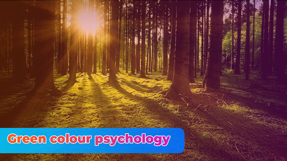
Occurring in nature so often, green is strongly associated with growth and rebirth, and the colour of spring (in the west) and youth, and with renewed and restored energy. Green has also been allocated as the colour of safety and permission – which is why green means ‘go’ on traffic lights.
Although green has the associations with renewed health, there are plenty of associations with green and poison. Verdigris in paints in the nineteenth century were highly toxic, containing copper and arsenic. The expression ‘green at the gills’ implies someone is looking unwell, and likely to be sick.
“For still there are so many things that I have never seen: in every wood in every spring there is a different green.” J. R. R. Tolkien
Effects of green
Green is thought to be a nurturing colour, and can help to rejuvenate the body when feeling exhausted in any way. It is also observed that green helps us to see situations clearly, so can help with situations where diplomacy and agreeability is needed. It has been found that green can encourage ‘social joining’ of clubs and other groups, and evoke a feeling of needing to belong.
Positive connotations associated with green
- Growth, vitality, renewal and restoration
- Self-reliance, reliability and dependability Tact
- Emotional balance and calm
- Nature
- Family oriented practical and down to earth
- Sympathy, compassion and nurturing
- Generosity, kindness and loyalty
Negative connotations associated with green
- Possessiveness and materialist
- Indifference and over-cautious
- Envy, selfishness, greed and miserly
- Deviousness with money
- Inconsideration
- Inexperience
- Hypochondria
Common uses of green
Green is the colour of US banknotes – originally selected as the colour for banknotes in 1861, and used to deter counterfeiters, since the colour on the reverse of the note did not show through. Over time, green has come to be associated with a strong, stable currency.
Green is also, unsurprisingly perhaps, widely associated with political parties and non-governmental organisations that are concerned with the environment.
Brands that use green
- Tropicana
- Monster
- Android
- BP
- Spotify
- Whole Foods
- Starbucks
- Land Rover
- Holiday Inn
Shades of green
Emerald, jade, lime, forest green, British racing green, moss, olive, aqua, grass
Blue colour psychology
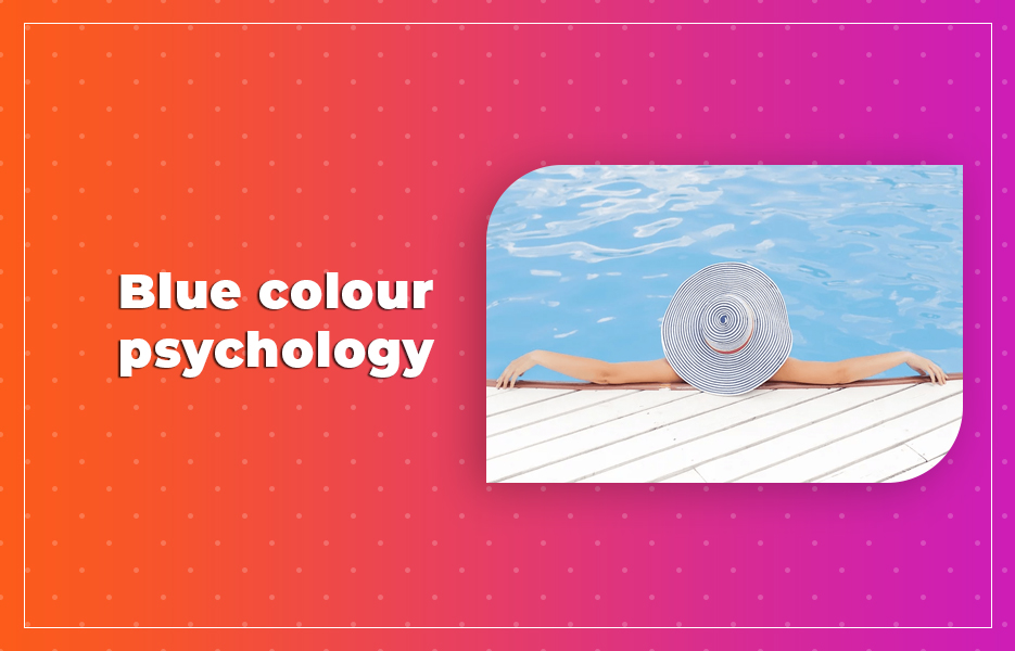
One of the three primary colours, blue is seen as a colour of trust, honesty, loyalty and responsibility. It’s often associated with sadness, but also represents calmness and responsibility, and is used to reduce stress. We all feel better on a bright day when the sky is blue and the sun is shining brightly! (although, interestingly – the sky and the sea are not actually blue – they just appear so due to Rayleigh scattering)
Effects of blue
Blue is thought to have positive effects on the body and mind. Strong blues are thought to stimulate clear thinking, and lighter blues to calm the mind and help with concentration. Overall, blue is a serene and mentally calming colour, and can help to aid clear communication.
Blue is seen as a typically safe, conservative colour that can help us have direction and order. In 2020, Pantone announced Classic Blue as the colour of the year – “Instilling calm, confidence, and connection, this enduring blue hue highlights our desire for a dependable and stable foundation on which to build as we cross the threshold into a new era.” Perhaps unsurprising, considering the major changes occurring in the world as we enter the 2020s.
“I will do water – beautiful, blue water.” – Claude Monet
Positive connotations associated with blue
- Loyalty, trust and integrity
- Tact, reliability and responsibility
- Conservatism
- Perseverance and devotion
- Care and concern
- Idealist and order
- Depression and sadness
- Passivity
- Self-righteousness
- Emotional instability
- Conservatism and outdatedness
- Predictability and weakness
- Unforgiving
- Frigidity, coldness and aloofness
- Authority
- Contemplation, peace and calm
Negative connotations associated with blue
- Rigidity
- Deceit and spite
- Manipulation, unfaithfulness and untrustworthiness
Common uses of blue
Blue is commonly used in uniforms – it is one of the most commonly chosen colours for schools to choose for their uniforms, and unsurprisingly is the colour of the Royal Navy Action Working Dress.
In western cultures, blue is commonly used by banks, because of the association with trust and authority, and is generally considered to be masculine, so is often used to represent baby boys. However, as we’ve already mentioned – prior to the 1950s, blue was more commonly associated with girls and thought to be daintier.
Around the world, blue is used widely in religious icons – in Catholicism, the Virgin Mary is often depicted wearing blue, the Hindu god Krishna is blue, and in the Middle East, blue is strongly associated with heaven, spirituality and immortality.
Brands that use blue
- American Express
- Dell
- Oral B
- Oreo
- HP
- Tiffany and Co.
- IBM
- Skype
- Vimeo
Shades of blue
Sapphire, baby blue, classic blue, azure, periwinkle, powder blue, navy, cornflower, aquamarine, cerulean, teal
Purple colour psychology
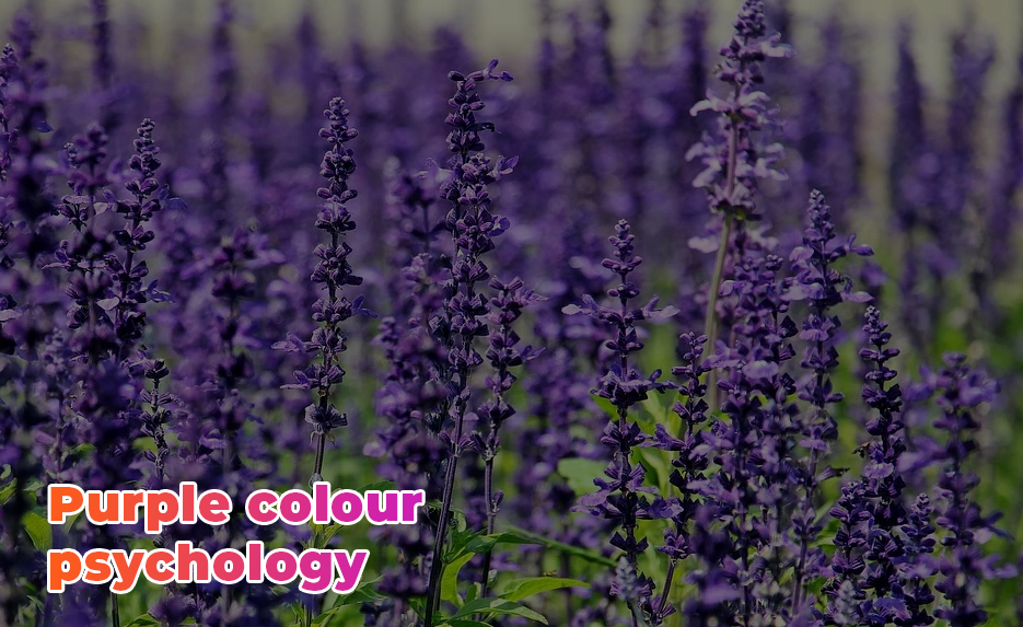
Purple is a rich, deep colour strongly associated with royalty, and hence has been chosen by brands that are looking to imply a sense of luxury, such as Liberty of London. It’s thought that in ancient times, only royalty could afford the purple dyes as they had been extracted from snails in the Mediterranean. With the colour being so unattainable, purple also came to represent spirituality and holiness – and of course, emperors, kings and queens who wore the colour are thought of as being linked to gods, or descendants of gods.
Effects of purple
Purple is thought to have a calming effect on the body, and uplift spirits, but too much purple has been found to bring out irritability, impatience and arrogance in people. Because purple is made up of red and blue, is can be found as being used in items or rooms that are sensual and passionate.
Purple shades are often used where inspiration, and imagination are required. For similar reasons, as well as the links to royalty due to the rarity of the colour, purple is often applied in spiritual settings.
“Soon it got dusk, a grapy dusk, a purple dusk over tangerine groves and long melon fields; the sun the color of pressed grapes, slashed with burgandy red, the fields the color of love and Spanish mysteries.” – Jack Kerouac, On The Road
Positive connotations associated with purple
- Unique and individual
- Creativity and inventiveness
- Psychic and intuitive
- Humanitarian and selfless
- Mystery and fantasy
Negative connotations associated with purple
- Immaturity
- Impracticality
- Cynicism, aloofness, pompousness and arrogance
- Fraud and corruption
- Delusions of grandeur and the social climbing.
Common uses of purple
As with all colours, the colour purple has different meanings worldwide. In China, purple is thought to represent spiritual awareness, physical and mental healing, strength and abundance, whereas in Japan, (like some western cultures) purple is the colour of privilege and wealth. In Thailand, widows in mourning tend to wear purple to signify their loss.
Purple has sometimes been associated with the LGBT community.
Purple has become synonymous with chocolate. Cadbury has used purple for generations, and trademarked the colour purple for chocolate with registrations. However, Swiss brand Milka have used lilac on their packaging since 1901, and Hershey’s, Reece’s and Nestlé (on Quality Street) have all used purple on their chocolate wrappers at some time.
Brands that use purple
- Cadbury
- Milka
- Aussie
- FedEx
- Yahoo
- Hallmark
- Welch’s
- Liberty London
- Taco Bell
- Asprey of London
Shades of purple
Amethyst, lavender, lilac, mauve, plum, deep purple, violet, aubergine, byzantine, mulberry, pomegranate
White colour psychology
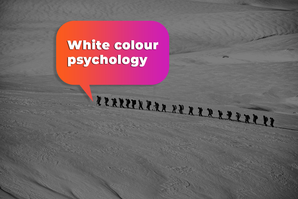
White is strongly linked with light, goodness, innocence, purity and cleanliness. The phrase ‘turn over a new leaf’ means to turn to a new page in a book – one that is fresh and clean. In western culture, this purity has traditionally been applied to virginal brides, who wore white dresses to signify their purity as they marry. However, in some Asian countries, white has been used to represent death, mourning and bad luck, as it has been traditionally worn at funerals.
Effects of white
White is bright and reflects light. Interior designers choose white to help rooms feel more spacious, and hospitals use white on the walls to convey sterility. However, some people feel that white rooms can feel too stark, cold or isolated, boring or bland.
In marketing, white is used for much of the same effect – to convey a feeling of safety, purity and freshness.
“I have said that black has it all. White too. Their beauty is absolute. It is the perfect harmony.” – Coco Chanel
Positive connotations associated with white
- Innocence, purity and cleanliness
- Equality
- Completion and wholeness
- Simplicity
- Immaculate and neat
- Self-sufficiency
- Cautiousness
- Plain and unimaginative
- New beginnings
Negative connotations associated with white
- Sterile and stark
- Fastidiousness
- Emptiness and distance
- Isolation
- Boring
Common uses of white
The association of white with purity and cleanliness is strong within religion – in the Roman Catholic church, white is worn during celebrations, in Islam white is worn during the pilgrimage to Mecca. In Judaism, white is worn during the Yom Kippur rituals, and in Shino and Zen Buddhism, white gravel, stones and sand are used to mark sacred places.
Doctors and scientist have worn white since the late 1800s, when the switch from dark coats was made. The change implied the doctor was clean, as stains were harder to hide. Although today white isn’t necessary to hide stains – any colour could be used, there is research to show that patients have increased trust in the symbol of the white coat.
Brands that use white
- The White Company
- Mini
- Tesla
- Squarespace
- The North Face
- ASOS
Shades of white
It might be a funny thing to say – shades of white. White is white, isn’t it? Technically, yes, but there are shades that are considered to be off-white. These include pale cream, eggshell, ivory, vanilla and magnolia, parchment, champagne and alabaster.
Black colour psychology
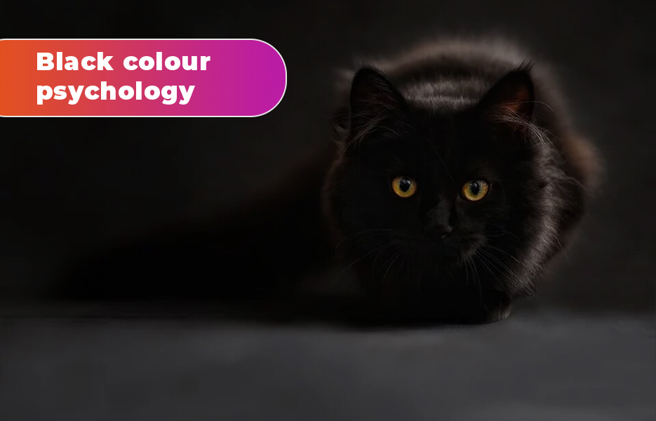
The darkest of all the shades, black is often associated with the unknown. The colour most associated with darkness, it is sometimes thought of as depressing and pessimistic, but also sophisticated and serious – such as with little black dresses and black tie suits.
Effects of black
Black has been found to invoke feelings of aloof sophistication. It’s incredibly formal as a colour to wear, but since the colour is (in western societies) associated with mourning the passing of loved ones, it can be depressing and encourage us to become pessimistic.
“I wore black because I liked it. I still do and wearing it still means something to me. It’s still my symbol of rebellion—against a stagnant status quo, against our hypocritical houses of God, against people whose minds are closed to others’ ideas.” – Johnny Cash
Positive connotations associated with black
- Protection and comfort
- Strength
- Containment
- Formality and sophistication
- Seduction
- Mystery
- Endings and beginnings
Negative connotations associated with black
- Aloofness
- Depression and pessimism
- Secrecy and with holding
- Conservatism and solemnity
- Power and control
- Sadness and negativity
Common uses of black
In western cultures, black is often associated with mourning, darkness and evil, in relation to the devil being referred to as ‘the prince of darkness’. However, there is plenty of use of black in religion. Priests and pastors from the Roman Catholic, the Eastern Orthodox and Protestant churches often wear black. In Islam, black is said to have been the colour of the banner carried by Muhammad’s soldiers, and in Hinduism, the goddess Kali is often portrayed with black or blue skin.
Black Friday started in the United States, and has become popular internationally. It’s the day after Thanksgiving, when it is said that retailers begin to make a profit – or, to put it another way – are ‘in the black’. This phrase came about because accountants used black ink to show profit, rather than the red of making a loss.
Throughout the 19th and 20th centuries, functional items such as machines and other devices were painted black to imply that they were a functional item. Sewing machines, ships, cars and telephones were created in black. Indeed, the Ford Model T – the first car ever made on a mass scale, was only available in black for over a decade. Today, cars are of course still painted black – with cars that are used for occasions, such as limousines and hearses still almost always painted black.
Brands that use black
- Apple
- Chanel
- Calvin Klein
- Disney
- Louis Vuitton
- Cartier
- Prada
- Sony
- Gucci
- Ralph Lauren
Shades of black
As with white, it does seem strange to think of shades of black, but these are plenty of shades that are dark and resemble black. These include ebony, onyx, jet, charcoal, obsidian, raven, pitch, slate, sloe, blackberry
Grey colour psychology
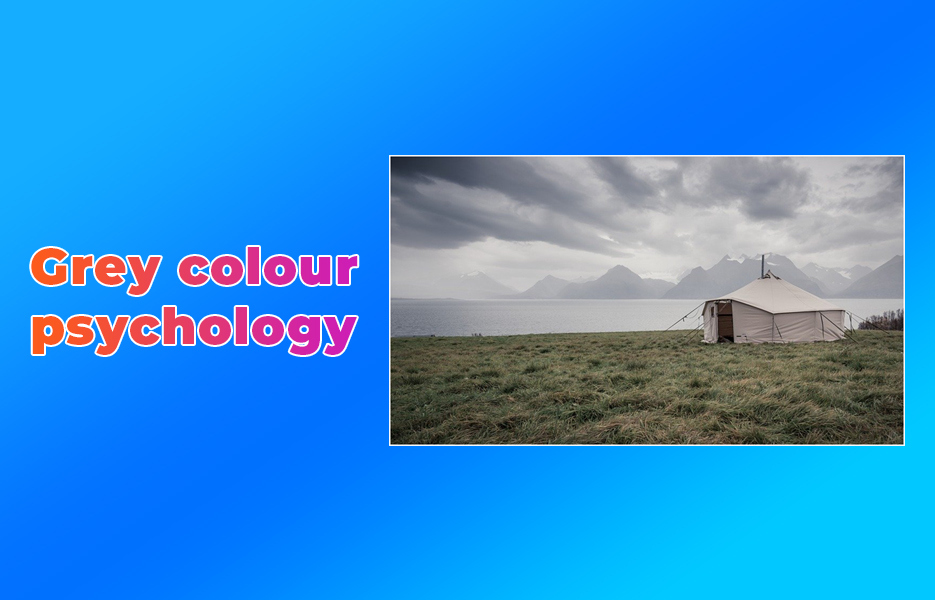
As the colour partway between light and dark, shades of grey are thought of as neutral, which can also imply conservative and boring, but in contrast, can be seen as elegant and formal. The associations of grey hair with aging links the colour with maturity and responsibility, and safety and dependability. In design, grey is pretty neutral – it can be paired alongside many colours to great effect, steadying brighter colours and illuminating softer shades. It’s also between two shades that don’t feature on colour wheels – white and black.
Effects of grey
The effects of grey can be different depending on the shade. Lighter greys can be soothing and calming, in contrast with the solemnness of darker greys – which are linked with depression, self-denial or lack of emotion. Since darker greys are closer to black, it’s not surprising that those feelings seep through. In interior design, grey is used as a neutral that can moderate brighter colours.
“A grey day provides the best light.” – Leonardo da Vinci
Positive connotations associated with grey
- Reliability
- Conservative dignified, Neutrality and impartiality
- Professionalism and reservation
- Maturity
- Intelligence
- Classic elegance and formality
- Solid, stable and dependable
- Calming and subdued
Negative connotations associated with grey
- Indecisiveness
- Unemotional and indifferent
- Boring
- Sad and depressed
- Lifeless
- Lonely and isolated
Common uses of grey
Grey has been the preferred colour of warships as a form of camouflage. Between the world wars, the Royal Navy painted ships different shades of grey depending on where in the world the ships were operating. Today, many navies worldwide, including the Royal Navy use shades of grey for their warships, for camouflage purposes, even though with radar technologies this is less necessary.
Brands that use grey
- Wikipedia
- Forbes
- WordPress
- Mercedes-Benz
- Nissan
- Bing
- Swarovski
Shades of grey
Dove, iron, slate, ash, silver, smoke, dust, heather, mousy, battleship
Brown colour psychology
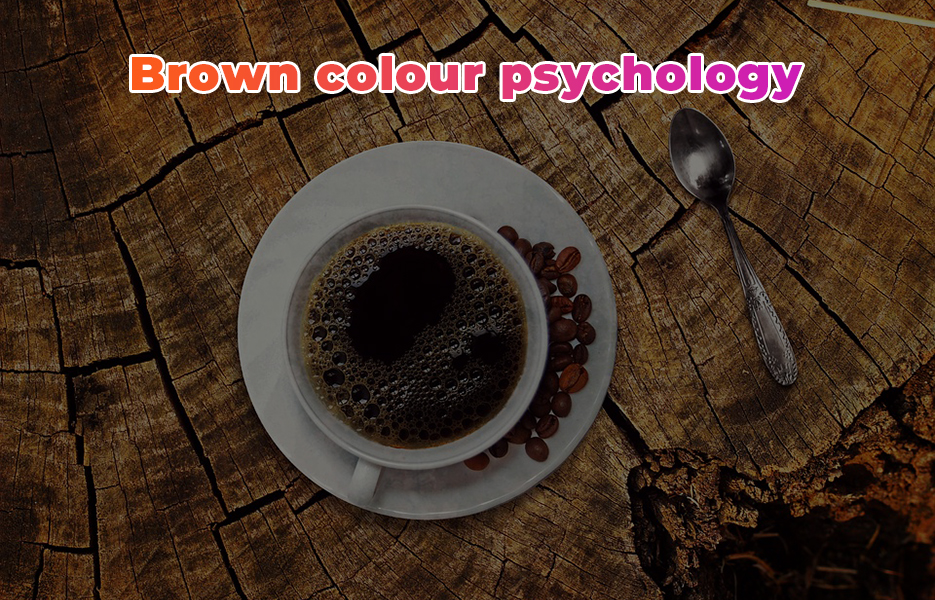
The colour of soil, brown is thought of as a colour that signifies stability, structure and support. It’s a wholesome colour that is usually associated with autumn and winter, and is often used for environmentally friendly, and ethical schemes. It’s also a rich warm colour that can be sophisticated, such as in the use of brown leather (or faux leather) items like luggage or furniture, or in chocolate and coffee.
Effects of brown
Brown can be found to have protective and comforting effects. Brown shades are linked with feelings of stability and security, perhaps in part due to the link that brown has with earth.
“…Kate like the hazel-twig Is straight and slender, and as brown in hue As hazel-nuts, and sweeter than the kernels.” – William Shakespeare, The Taming of the Shrew
Positive connotations associated with brown
- Down-to-earth, wholesome and practical
- Friendly and approachable
- Stable, structured and supportive
- Comforting, reliable and protective
- Strength
- Sensitivity warmth and reassurance
- Honesty and sincerity
Negative connotations associated with brown
- Dull and boring
- Frugality,cheap and stingy
- Materialistic
- Lacking humour
- Lack of sophistication
- Predictability
Common uses of brown
Brown, and shades of brown such as khaki are popular colours for uniforms worldwide. It has traditionally been a colour that is widely available, and difficult to see – especially in the case of woodland camouflage uniforms.
In industry, brown is most often used by companies promoting chocolate and coffee, but also notably by the United Parcel Service (UPS).
Lighter shades of brown such as fawn are often used for carpets and soft furnishings as they do not show stains and marks quite as easily as lighter, or darker shades.
Brands that use brown
- UPS
- Nespresso
- Hershey’s
- Ugg
- M&M’s
- Hollister
Shades of brown
Beige, chestnut, chocolate, khaki, russet, topaz, tan, walnut, amber, coffee, fawn, mahogany, russet, tawny
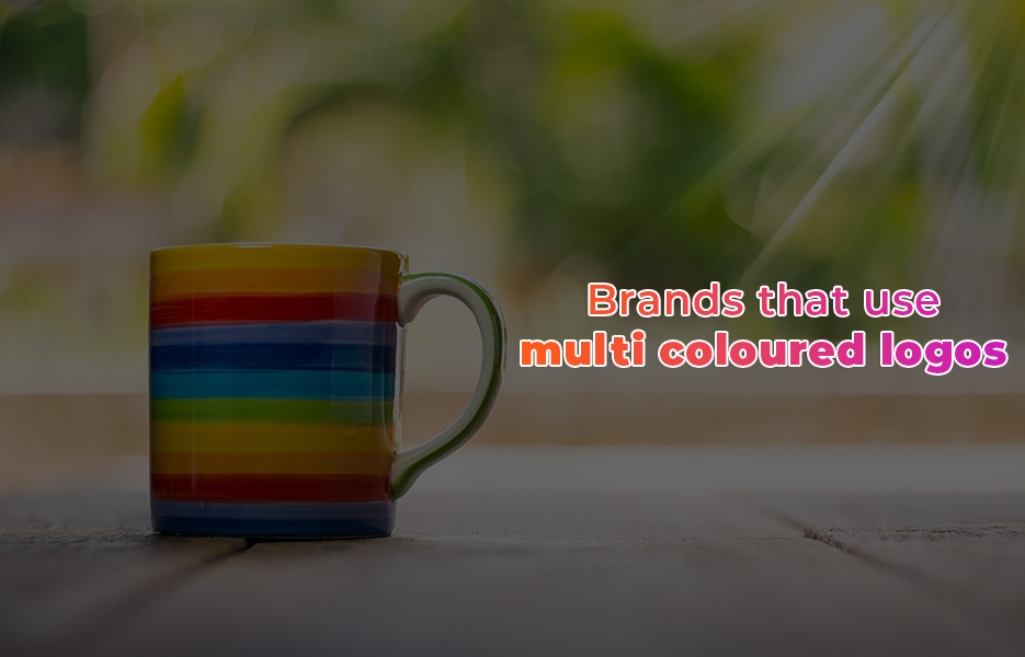
Brands that use multi coloured logos
“Try to be a rainbow in someone’s cloud.” – Maya Angelou
Brands that have multi coloured logos are often trying to convey their sense of fun, that they are easy-going and multidisciplinary. Take Google and Microsoft as great examples – both their businesses stretch far beyond what they started out offering. Google might have started as a search engine, but it quickly turned into something far, far greater – including email services, online storage for files and photos, the Google Play app store, and translation and shopping functions. That’s before we even mention that Google owns YouTube!
- NBC
- eBay
- PlayStation
- BT
- Microsoft
- Sky
Common uses of multicolour
Multicolour, and more specifically, rainbows have occurred frequently in mythology and have continued to have relevance to today. Rainbow flags have been used since as far back as the 16th century when the Cooperative movement in the German Peasants’ War used them, through to use by LGBT organisations and social movements from the 1970’s through to today.
Use of colour to denote gender
Although colours have traditionally been used to suggest whether a baby is a boy or a girl – blue or pink respectively – it hasn’t always been this way. Prior to the 1950s, blue was seen to be a daintier colour, and was more associated with girls, and pink was the stronger colour. The 1950s saw a push in advertising campaigns that promoted pink as a feminine colour – and so the stereotypes were forged.
Since the rise of rose gold products, and the rise of ‘Millennial Pink’, beliefs have shifted about this shade of pink. Many millennials believe the shade is ‘genderless’.
The meanings behind colours are of course, assigned to the colour by us as humans. However, there has been a shift away from using pink and blue to suggest female and male – so if you’re marketing items that are primarily aimed at one gender, think about whether you’re potentially alienating some customers before going ahead.
Rebranding your business

If you’re thinking of rebranding your business, you’ll need to have a think about your business as it stands. Think about who you are, and what you do initially, before what you want to be known for and why it would add value to your business to rebrand right now.
If you’re certain that now is the right time to rebrand, talk to your customers – they will know whether your current image suits what they are looking for. Think about using surveys or focus groups, or your social media followers to help you establish what – if anything – is the right move for you.
Think about, then decide what the USP of your business is. Do you sell budget-friendly items, or is your focus on quality, designer brands? You might think that trying to sell to everyone is the right way forward, but in reality, this won’t serve you – you need to find the right niche. Do your research if you need to, and try and set your identity in just a few keywords.
Once you’ve got to this point, you’ll need to make a list of absolutely everything that will need rebranding. Look at all your marketing materials, from your business cards to banners, your website and so on. Will you need to redecorate your premises, or aspects of it – like the reception desk? When you’re considering your new design, you’ll need to decide whether the logos, and brand assets work with everything you need it to, and whether it supports your brand strategy.
When you’ve decided on your branding, make sure your team are behind you with your design. Take their concerns on board – if they don’t like your branding, or point out potential issues with it, listen to them – they have to be supportive, or your rebrand may end up flopping.
Once everything has been agreed with your employees, start the hype. Get your staff excited by throwing a little party – it doesn’t have to cost much, maybe just a lunch. Then launch the rebrand to the public – make it clear as to why you’ve rebranded, and why it is good for them, so that your customers can continue to trust you. Make sure your materials are all updated as quickly as possible – delaying the change, or gradually dragging it out can become confusing, and leave your customers wondering what is going on.
Once you’ve rebranded and the work is complete, be sure to get feedback from your customers – either in person, using online surveys like SurveyMonkey, invite comments on your social media channels and so on.
There’s a lot to think about when you’re choosing your logo and your branding. Whether you’ve chosen a colour scheme already, or you’re creating a more in-depth strategy when it comes to your colour scheme because you’re planning on taking your business global, colour psychology has a lot to offer you. Don’t stop with what we’ve talked about here – move on to create your own brand guidelines, considering why you have chosen the logo you have, pick your font, spacing and so on. It all adds up to a powerful first impression for your customers, which will help them decide instantly whether they want to do business with you.

DropShip products from verified suppliers to diversify your inventory and scale your eCommerce business